Tuesday, 17 November 2015

Editing: Typography

To add to the uniqueness of my artist, I wanted to use an original font for my digipak. So instead of using default fonts on Photoshop, I decided to look online for some fonts. Websites like Dafont are excellent for situations like this as they have an abundance of unique fonts added almost every day. 

The font I chose for my digipak is called "Glass Houses", I found this under the "Funky" tab of their website. I like this font as it is similar to the effect I added previously onto my digipak with the wind effect - it's disrupted. 

Here's what my artist's name looks like in the typography chosen. It's really similar to fonts of the 80's which is another reason why I chose this font. 
My inspiration, font from the 80s.
For the colouring of my font, I don't want to use a solid colour because as i'm already using a range of colours with the photo, I need to imitate this; since a variety of colours is part of my house style. Although, I don't want the rainbow to be seen as gimicky, so I will keep the gradient style of the 80s and just use a small bracket of the rainbow. To achieve this, I will use the gradient overlay tool in photoshop as I can select the amount of colours I want to use.


colour inspiration


When you double click the text layer, a pop-up with a variety of manipulating tools appears. When you click gradient overlay, you're able to select either default gradient settings of create a new one. I went through and really liked the blue, red yellow default preset.


 Once you choose the gradient effect, you're able to edit it even further. From previous experience of this tool, I know you're able to choose the style the gradient appears: either linear (horizontal) angle (radial) and even more. So I chose the angle as the gradient has a 360 effect.
Here's the final look after the gradient tool.


This is the finished product.


Editing: Wind Effect

 For my digipak, I like the idea of it looking like it came straight from an old VHS television; I like that the glitches and scan lines that disrupt the image.

This is the image before the editing started. 
This is the photo after the editing process. As you can see, the rainbow hand is all disrupted and is slightly fading to the left.


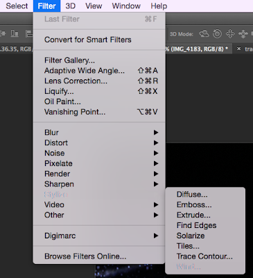
To achieve this effect, I went onto Filter > Stylise > Wind. The wind effect makes the image look like the wind is literally blowing it away.    


Once I clicked my desired effect, this pop-up appeared with many different ways the wind filter can manipulate the image. I chose to stick with the wind effect as the other two were no where near the effect I wanted to achieve. 


Wednesday, 11 November 2015

Second Test Shoot

After doing our first test shoot, I realised the photos we obtained weren't really living up to my standards; they didn't portray the ideas that I want to reach for and plus, it's always advised to do more than one shoot.

With the second photo shoot, I will be doing something completely different as new ideas have sprung into mind. However, I will be keeping some aspects of my last ideas from the previous photoshoot. I will be keeping the dark lighting and atmosphere the images will create - but using very dark, mostly completely black, to emphasise the semiotics of dark colours. The symbols being ambiguity, curiosity, isolation and also vulnerability. I believe these are all things teenagers experience, so my target demographic will be able to relate to it. Secondly, I will be using a new type of light source - using a projector to project an image onto a black wall and have somebody stand in front of it. I like this idea as it could kind of exemplify the images that are literally projected onto teenagers, images of perfection and idealisation. Again, my target demographic may be able to emphasise with this situation as teenagers are mostly the victims of living up to standards set by the likes of parents, school, friends and social media. Though, I will deliberately hide the person's face as then the body could be a vice for anybody to embody; as well, it strengthens to concept of ambiguity as you don't know who's there, what the person looks like or their emotions. 

I will use some close-up shots to provide the intimacy of the character but also long-shots to also signify how we don't know the person in the photo. 


With the person I will be using, ideally a girl, there are a few requirements I will want from the model: 
• Mise-En-Scene - with the costuming of the model, I want it to be really depict the vulnerability of the girl and really show her youth. Perhaps an unbuttoned shirt for intimacy as previously said, an album is an exposure to a personal life - intimacy is a stage of relationship where two people combine. 
•Performance - along along with the vulnerability, I want the girl to hide her face and perhaps hold herself, like she's comforting herself. As well, I will want her to shake her hair, so the images are slightly blurred - this could show an enraged mood of some sort, almost like teen angst. 


Equipment needed for this shoot:
•Camera
•SD card
•Laptop
•Projector
•Tripod
•Dark room

These are some images that were successful:


Tuesday, 3 November 2015

Multi-platforms

With our digipak, I want it to be completely unique and different from other albums on the shelves. I will include fun and interactive aspects that will act as a unique selling point to draw in my target audience.

Firstly for my USP (Unique Selling Point), we're wanting to include a multi platform release for our album, so: releasing it on vinyl, CD Digipak, MP3 and even cassette tape. By releasing it on multi-platforms, it allows a wide variety of people to obtain and listen to the music, so there's no excuse for people not to buy it. Also by doing this, fans who will want to collect all of our discography, they may want to buy all of these platforms which works in our benefit.

Cassette Tape - 

Because we want to achieve the feel from our album that it was released in the 80's, we want to throw it back and produce a limited quantity of the album on a cassette tape. The cassette tape market is very niche now in 2015 but it will still act a USP and collector's item. From my own knowledge of things like Record Store Day or Cassette Tape Day, people go crazy for these media platforms - it's one day of the year that people appreciate these formats, as well as celebrating independent record stores.
News article of Cassette Store Day.

Urban Outfitters, a major company, is starting to sell Cassettes.


So we want to adopt this idea. This is the mock-up image I made of our cassette tape:


We still want to stick to the multicoloured house style, as cassettes are just plastic it'd be quite difficult to tailor it to how we wanted to but still keep the 80's vibe to it. So by having the transparent plastic slightly translucent with a rainbow tint, it'll still be a recognisable iconography of our style. The track-listing is still apparent on this format, almost like in a handwritten font which adds an intimate and personal feel to it. As in the 80's people used to make their girlfriends / boyfriends mixtapes, so I like this idea.

Vinyl:
Vinyl has really been brought back from the dead in 2015 as almost every artist now releases their music on this format. What I like the idea of vinyl is that it's physical in our hands, I know that CD is physical but the fact you conduct the music by placing the needle on the etched in sound waves on the slate of vinyl gives me the sense of power. I also like it when artist's album art is beautiful and having it in 12 inches is like a piece of art. Artists like Bon Iver who i've previously analysed gave me the inspiration to producing the album on vinyl due to having beautiful artwork in a bigger form.

This is the mock up idea of one of the vinyl:


Original pressing, unlimited pressings
With the vinyl pressings, which will be one of my USP, I want to have two editions to it; one being the original pressing that will always be produced and distributed and secondly, I want to have a limited edition pressing that's limited to around 500 so it acts as a USP within a USP. I have seen with many artists that they customise the vinyl themselves, the actual blackness of the vinyl is tailored to their like. Artists of similar genre like Jamie XX and M83 have previously took this route, which proves this is part of a genre characteristic:
M83
Jamie XX